

Is Your Site Mobile Ready for Google’s Big Algorithm Change?
We can get you a RESPONSIVE Website
By next week, Google will have completely overhauled its SEO algorithm. From sneak peeks in the industry, it is foreseen that responsive websites will get placed more highly in terms of business visibility. Top priority will be given to those websites which Google considers mobile-friendly. Currently, this change is being rolled out for searches on mobile devices. A team at SumAll estimated that, on average, a website that is not responsive enough could lose at least a third of their traffic, depending on their target audience. This fraction will be higher for those websites considered trendy by millennials and Generation Y members. Apparently this change is being rolled out for only mobiles and not tablets – for now.
This overhaul might come as an intense shock, especially for the Fortune 100 companies – it is estimated that 67% of the Fortune 100 companies’ websites are not mobile-friendly. Also, considering that 61% of total web traffic is generated through mobile devices (including tablets), it makes sense for everybody to begin relooking at their website designs and layouts for mobile-friendliness. So how can you ensure that by April 21, your website will have cleared the mobile-friendly hurdle?
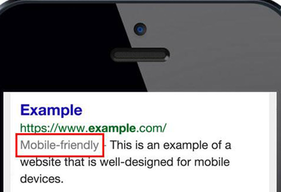
To start off, Googlebot must be allowed to scan even your CSS and JS content to be dubbed mobile-friendly. Small text and flash videos must be avoided, as they reduce the mobile friendliness of websites. Loading times for images and other content must also be optimized since Google has noted that it will weigh each of them individually. App downloads and other interstitials will also affect your mobile-friendliness. The overall mobile friendliness of a website will be judged on a page-by-page basis.
Mobile First is the new mantra engulfing the website design community. Since web traffic is increasingly coming from mobile devices, designers are now finding it easier to scale up from a mobile-sensitive design, than compressing all that information into a tiny preallocated space. To offer a flawless experience to both your desktop and mobile visitors, adopt either of three approaches available. One can go for Responsive Design, where pages are built to collapse neatly as their window view is resized. Another approach is Dynamic Serving, where pages recognize the device and service the appropriate code. The third approach is to go for an altogether Separate Mobile Page, where users are routed to a separate URL specifically for mobiles.


Sofia Helin
When, while the lovely valley teems with vapour around me, and the meridian sun strikes the upper surface of the impenetrable foliage of my trees, and but a few stray gleams steal into the inner sanctuary.